The Challenge
SYNE needed to look like an established brand from day one, but their product was still in development. The goal was to prove that an early-stage skincare brand can launch marketing, attract retail partners, and build a social presence with visuals that rival any established competitor. All before manufacturing is complete.
The Process
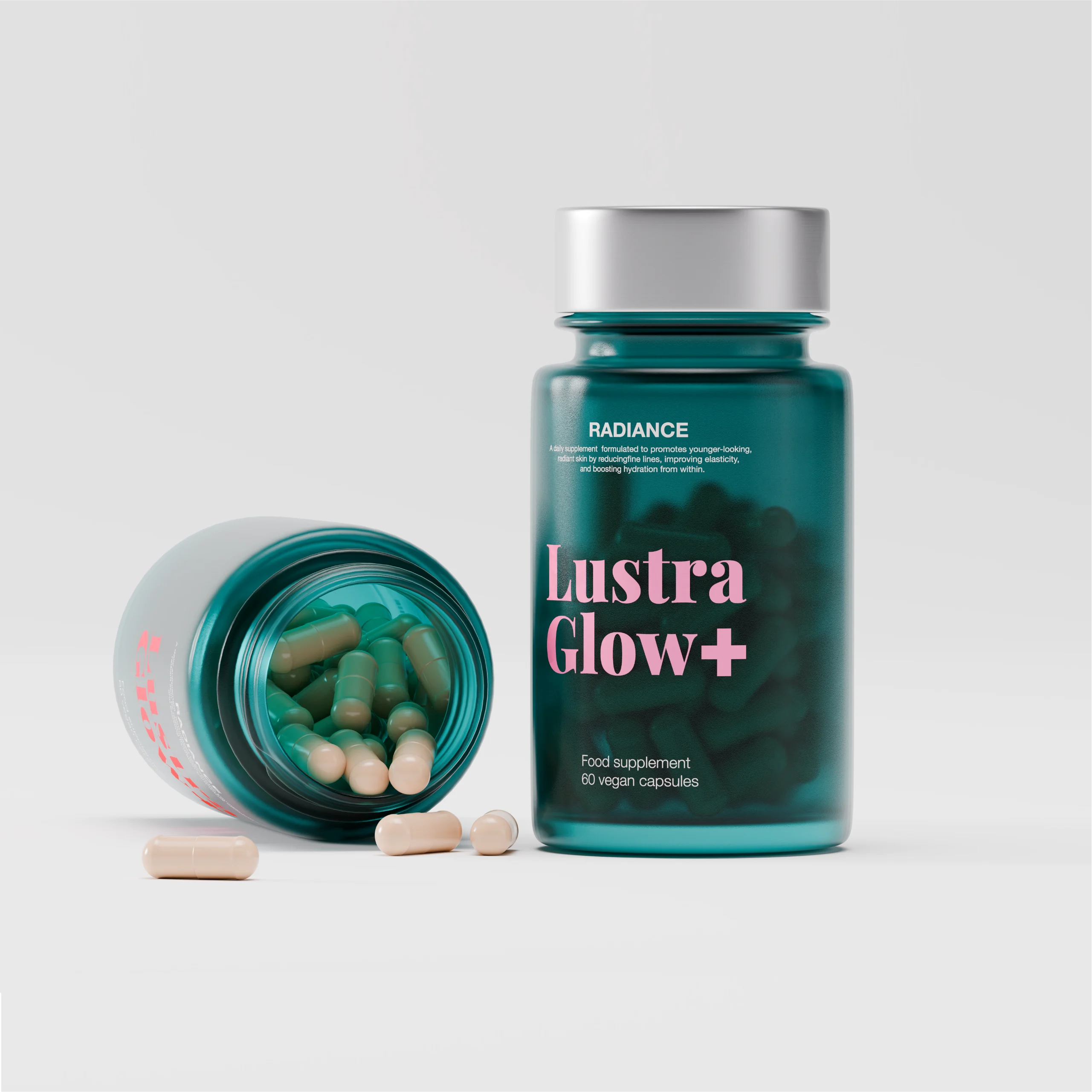
Everything started with the brand identity. I built a type system using clean, Swiss-style typography to give SYNE a clinical, high-performance feel that stands apart from the soft aesthetic most natural skincare brands lean into. From there I designed the packaging — a translucent pink glass bottle that immediately communicates the cherry blossom active ingredient, paired with secondary box packaging using custom die-lines.
The real differentiator came in the visualization phase. Custom liquid simulations show the serum in motion, demonstrating its lightweight texture and flow. Light caustics capture how light passes through the pink glass and the serum itself, creating natural light patterns that make the product feel alive before it physically exists.
The Result
Before a single unit rolled off the production line SYNE had everything an established brand needs to compete. A complete visual identity. Campaign ready assets. Retail pitch materials. The ability to run paid social from day one. None of it required a photo studio, a manufacturer, or a single physical product.
This is what a 3D first brand launch looks like.